Methane is an odorless, colorless gas that has one of the strongest effects on our changing climate. Known to be 23 times more potent than carbon dioxide as a greenhouse gas, methane emissions in the U.S. are primarily caused by natural gas and oil production, bioeffluents from livestock, and from landfills.
While methane emissions from natural gas production decreased in recent years due to a downturn in production and better measurement and control of leaks, attribution to livestock sources has increased. In the U.S., 29 percent of farms and ranches specialize in cattle. In California, there are 1,750 dairy farms that house 1.79 million milk cows. Approximately one out of every five dairy cows in the U.S. lives in California. As of January 2017, 5.1 million cattle are raised California, placing it in fourth out of the top five states with the most cattle.
Methane emissions from agriculture in the state of California are currently quantified through a complicated livestock accounting method. Methane emissions are also important in urban environments due to leaks from building infrastructure or aging pipes carrying natural gas.
Meanwhile, an increasing number of research studies are attempting to verify methane emissions in California using observations at state-wide or air basin scales. Our mobile platform makes possible the quantification of emissions at the level of individual farms (and other sources), thereby filling a critical spatial gap between bottom-up methods and air-basin scale top-down approaches.
What We Found
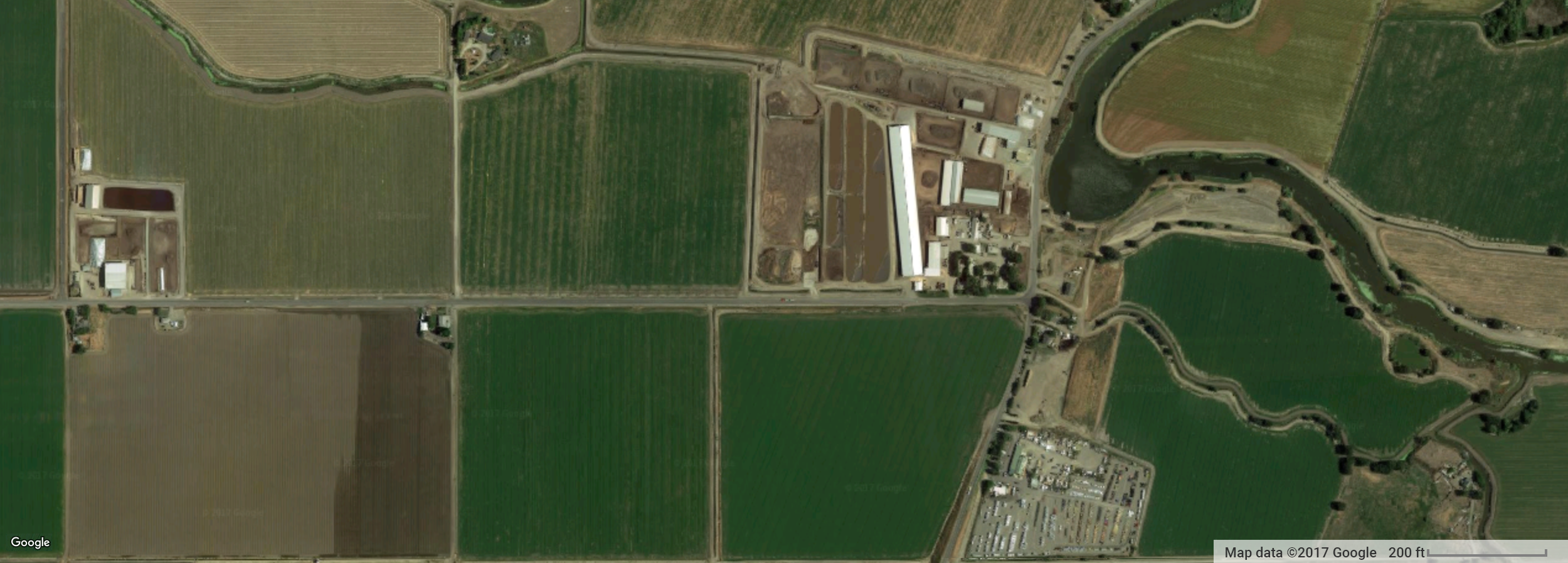
Methane hot spots were observed throughout the Central Valley. In many cases, zooming in on satellite imagery near these hot spots revealed farms nearby, as well as large herds of cows. Due to variable meteorological conditions from day-to-day, and hour-to-hour, the exact position, shape, and amplitude of the plume of emissions measured by the mobile platform varies from pass-to-pass. Arriving at a meaningful estimate of the methane emission rate from an individual farm relies, first, on being able to characterize the average methane signal in the plume traveling downwind of the farm. As a proof of concept, we examined one particular road segment close to a large farm (with cows visible!) which we passed by 74 times over a ~9 month period during 2 to 3 different seasons (winter, spring, and summer). During 55 of these passes, an obvious methane plume was detected.
What does the average plume look like and how persistent is it? Each of the traces in Figure 1 represents a one dimensional cross-section of the plume as it is being transported downwind of the farm captured as the car drove past. You could think of these plumes as being similar to that coming from a smokestack at a power plant. An obvious difference, of course, is that methane is invisible, as opposed to seeing smoke or steam from a power plant tower. These traces attempt to make these invisible plumes visible, showing the “enhancement” of methane above the background concentrations observed on either side of the plume. Typical background concentrations are approximately 2000 parts per billion (ppb) and what is shown in the figure represents the additional enhancement above this background when driving through the plume.
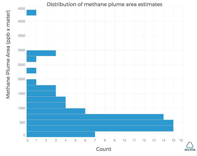
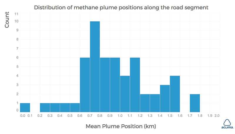
Calculating the area under the curve for each trace provides a metric that is proportional, in theory, to the methane emission rate from the farm (a sophisticated meteorological model is required to estimate the emission rate, however). Daily variation in the plume characteristics results in a range of plume area estimates, with the distribution shown in Figure 2. The location of the plume along the road segment also changes significantly from day to day (Figure 3), underscoring the advantage of using a mobile platform vs a single fixed-location sensor. Variability in plume area and position is due to some combination of emission rate variability and meteorological variability (wind direction, wind speed, and boundary layer stability). Adequately accounting for this variability by driving past this farm multiple times is required before an accurate emission estimate can be determined.
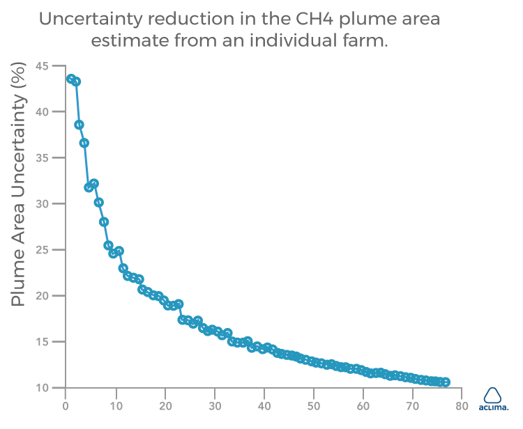
How many passes before we are able to capture the mean characteristics of this particular emission source? Figure 4 below shows how uncertainty is reduced in the mean methane plume area estimate as the number of passes increases. This is the same basic statistical principle as, for example, political polling where the more people that are polled within a given population, the closer the poll comes to reflecting the truth. In this case, we find that after 10 passes, the uncertainty is reduced to by almost half, from ~45% to less than 25%. After 20 passes, uncertainty is reduced to less than 20%. Interestingly, our driving in West Oakland revealed that a similar number of passes is required to characterize hot spots in a much more urban and industrialized setting.
Important Take Homes
Because of rapidly changing winds, the plume position and the rate that it disperses as it is carried away from the source is quite dynamic. Mobile measurements allow us to account for these dynamics to some extent, even when compared to a perfectly positioned fixed sensor. Whereas a fixed sensor may oftentimes be sampling at the plume edges, thus underestimating the amount of methane in the plume, mobile measurements allow sampling throughout the cross section of the plume. The mobile platform also allows us to sample across tens and potentially hundreds or thousands of farms or other methane sources, such as oil and gas wells. Measurements of this type at the individual farm scale and across various different types and sizes of farms could provide a data set with which to identify best practices for reducing methane emissions from dairy and other livestock operations.
How We Did It
Before we drove communities in California’s Central Valley, we weren’t sure what our sensing system would find in terms of methane. Initially, in the winter of 2016 and 2017, we chose to do more sparse driving across a handful of cities (Tracy, Stockton, Modesto, Manteca, and Turlock) that were accessible using San Francisco as our home base.
Later in 2017, we focused on high density driving in Modesto due to its unique combination of industrial, urban, and agricultural emission sources. We made repeat trips along I-99 and I-5 to capture hyperlocal data about the region’s methane emissions. We also measured black carbon, ozone, and carbon dioxide at the same time to get a holistic picture of the pollution load facing the Valley from a number of sources.
AQ&U
Seeing the environmental impact of our industrial and agricultural activities helps us better understand how our actions affect our environment. All of this is to say, that the more data we have about emission sources like methane, the better equipped we will be to find solutions to reduce or capture the gas so that it doesn’t continue exacerbating climate change.
Tracking these sources through innovative technology, like that developed by Aclima, will allow us to finally see data in real-time and be able to apply on-the-ground solutions to confirm the effectiveness. Solutions offered by Aclima’s hyperlocal data visualizations will arm farmers, ranchers, and policy makers with new layers of data that can inform best practices that protect people, profits, and the planet.
Learn More
To request the data from this data snapshot, please apply here. Read our data snapshots of the Los Angeles and the Bay Area to learn about air pollution near LA schools, and the worst wildfire season in California’s history.
Share this
Where Agriculture, Geography, and Climate Affect the Air
Taking it to the Streets: Aclima Brings Street-Level Environmental Sensing to CicLAvia