As California experienced record-breaking wildfires devastating communities across the state, smoke from these fires blanketed hundreds of miles with choking air quality on par with, and at times worse than, the most polluted cities in the world like New Delhi and Mexico City.
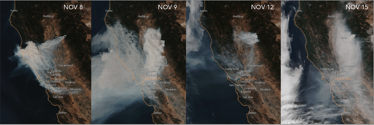
In satellite imagery, wildfire smoke was seen spreading over much of California. Yet while satellites can offer us a top-down view of how smoke spreads across vast regions, what does air quality look like at a localized, street level?
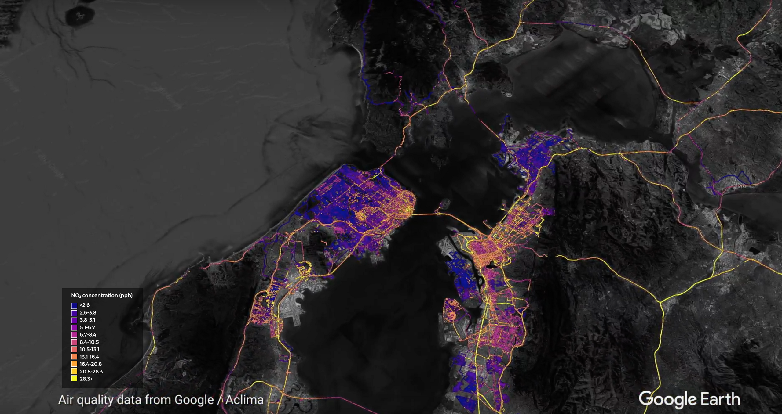
During last year’s wine country wildfires in the Napa, Sonoma, and Mendocino counties, we examined how our mobile mapping platform could map regions affected by fire emissions. In an effort to understand and quantify the impact of the most recent wildfires on local air quality, Aclima deployed vehicles equipped with our mobile platform to map air quality in communities across the Bay Area. With fires in California increasing in frequency and intensity due in part to drier conditions driven by climate change, hyperlocal air quality data can help policy-makers, state officials, and citizens make informed decisions about how to protect public health.
Day 1: Smoke Starts to Roll Into Bay Area
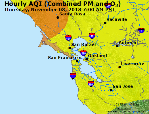
On November 8, Camp Fire, the deadliest and most destructive wildfire ever in California, was reported at 6:33 AM. The fire accelerated rapidly, burning the equivalent of a football field every second and reached the outskirts of Paradise by 8 AM. Winds blew the smoke west and south along the California coast. The EPA AirNow maps below show how the increasing ground-level particulate matter (PM) concentrations move southward along the coastal range eventually reached the East Bay regions at 3 PM.
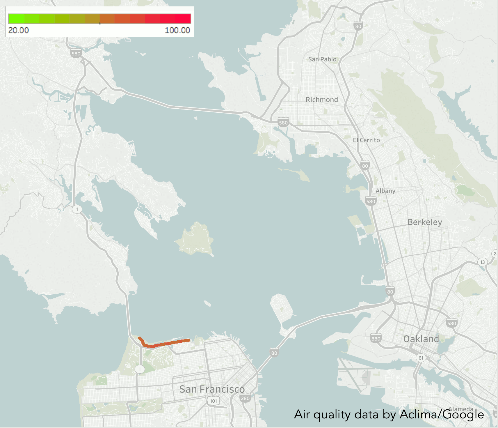
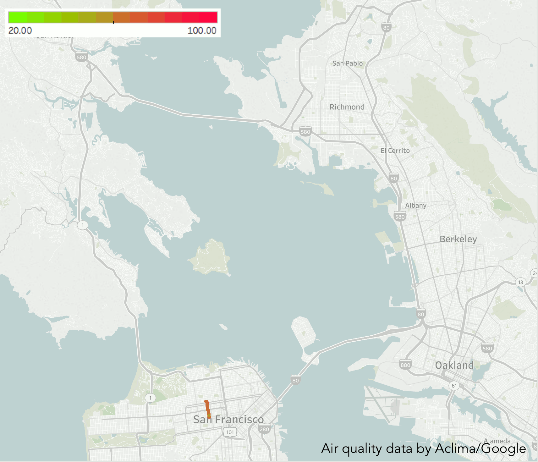
Two of our mobile labs were mapping in San Francisco the morning of November 8 and traveled across the Bay Bridge in the afternoon to make measurements in Oakland. The cars both measured increasing particulate matter concentrations in the East Bay throughout the afternoon. With our mobile mapping platform, we were able to observe variations in meteorology and atmospheric transport results in smoke-filled air arriving in some cities and regions before others. One car encountered a region of elevated PM concentrations in the middle of the Bay Bridge just after Treasure Island, with mass concentrations increasing by over two orders of magnitude over the space of a few meters. The other car measured a region of extremely high PM concentration between the Fruitvale region of Oakland and northern San Leandro showing an order of magnitude higher concentration or more than the already elevated levels. These observations allow us to see plumes of smoke-filled air moving as a front across the bay, with the air before it relatively clean and a few meters later, heavily affected by smoke.
Day 2: Smoke Spreads Throughout Region
On November 9, our two mobile labs began their day in San Francisco with one headed across the Bay Bridge and one across the Golden Gate Bridge into Marin and then over to the East Bay. Particulate matter concentrations were elevated in San Francisco but lower in the North Bay and East Bay. You can see a particularly sharp decrease in concentration as the car crossed the Golden Gate Bridge. By the time the car arrived back in San Francisco, the concentrations dropped again. This general spatial pattern is likely reflected in the stationary data, although those measurements would not be able to show as much granularity.
The results of the mapping show that regions affected by elevated PM concentrations were still patchy and variable. Both of the cars passed through a patch of elevated PM concentrations between El Cerrito and Berkeley where the levels were 1.5 times greater those measured on either side. One particularly strong example of how sharp the boundaries between higher and lower areas of smoke affected PM occurred in Richmond.
Between 2:45 and 3:55 pm, our data showed that PM concentrations double east of 20th street. The extent of the areas influenced by fire emissions were evolving rapidly, influenced by meteorology and transport. The emissions from the fire were now being blown to the south, but the smoke from the previous day was still lingering along the coast range.
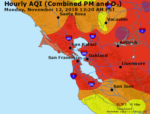
The Week of Nov. 12: Smoke Saturates San Francisco Bay Area
By the week of November 12th, we observed very little spatial variation in the mapped PM concentration. The Bay Area was saturated with a dense layer of choking smoke. Unusually stagnant air allowed the smoke to accumulate in the Central Valley and spread westward into the Bay area, even lingering over the Pacific Ocean. AQI maps from the week show the entire region as “unhealthy” increasing to “very unhealthy” as the week progressed.
With little variability in smoke concentrations, we took a couple of days to observe the vertical structure of the pollution. We drove up to the summit of Mt. Diablo, elevation 3,849 ft, in the East Bay. The car reached an elevation where the measured PM levels decreased dramatically, decreasing from ~65 to ~15 ug/m3 between the junction and the summit. This indicates that the car had moved above the mixing layer of the atmosphere, moving from a region where the smoke is vertically well mixed to the free atmosphere and cleaner air. For this example, measured on Monday, Nov. 19, the concentration above the mixed layer are close to typical concentrations for this time of year.
Most pollution formation and accumulation occurs in the layer of atmosphere closest to the ground, where we live, called the atmospheric boundary layer. The thickness of this layer changes throughout the day as the ground heats up, causing this air to rise and mix with cooler air above. This mixed layer generally expands rapidly in the morning and less so in the afternoon. Low boundary layers in the morning are the reason why tall buildings can be seen rising above a brown cloud of pollution. In the afternoon, cumulus clouds often form near the top of the boundary layer. With our data we are able to see this phenomenon in action and at a higher resolution. The image below from our insights page illustrates how pollution forms and exists at different layers of the atmosphere over the course of a day.
Air Quality & You: Why It Matters
Over the course of the Camp Fires, we were able to observe how the Bay Area filled up with smoke, evolving from smoke plumes to a homogenous smoke blanketing the entire region. Aclima data showed not only how concentrations of particulate matter shifted over time, but also how variability in meteorology and transport can result in large differences between the amount of smoke in adjacent cities. In many cases, the change in concentration can be quite abrupt.
While smoke from the initial fire outbreak has begun to dissipate, the lasting effects for air pollution will be seen for decades to come. A study published in the Proceedings of the National Academy of Sciences found that there are now fewer bad days for particulate air pollution around the country because of air-pollution controls. But in the West, including parts of Oregon, California, Nevada, and Idaho, there have been more bad air days since 1988 due to forest fires.
It is clear that in order to address air pollution in California, policymakers must create climate mitigation strategies and policies that will address greenhouse gas emissions, which are fueling the increasing intensity and frequency of wildfires in the state. Not only can hyperlocal data from Aclima’s mobile mapping platform help cities inform residents during public health crises like wildfires, but it can also inform mitigation strategies as cities around the world reduce their climate change emissions.
Share this
Mapping Air Quality and Greenhouse Gases on Every Block in the Bay Area
Wine Country Wildfires