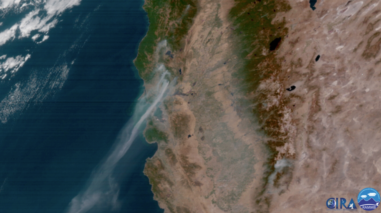
At the world continues to warm, scientists agree that there will be greater risk for fires on nearly every continent. Higher overall temperatures indicate a greater probability of a fire starting, spreading, and ultimately intensifying. And with more fires, more carbon dioxide and smoke is emitted into the atmosphere, intensifying health problems.
The impacts of fire on air quality and our health are well-known. However, the ability to measure the impact is challenging, as most fires occur in rural and rugged areas that are difficult to access for firefighters. Changes in fire intensity, wind direction, and other variables during the day affects where the emissions from the fire will be have the highest impact. The deployment of Aclima’s mobile mapping platform enables flexibility in the measurement of air quality in affected areas, providing a more localized picture of the air quality as the situation evolves in order to help local officials and citizens make informed decisions to protect their health.
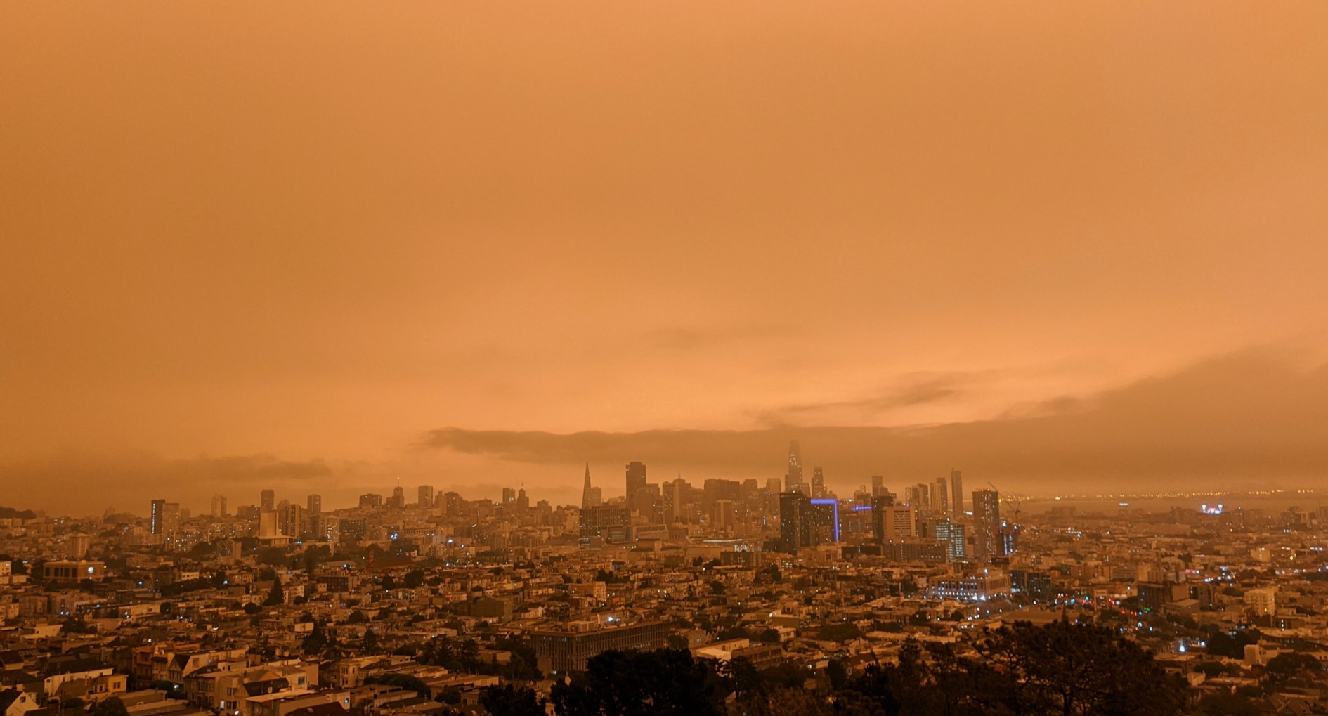
To explore how our mobile platform can help map regions affected by fire emissions, we deployed our Aclima-equipped Google Street View cars in October 2017 to assess the impacts of the fires in the wine country north of San Francisco. Several fires ignited on October 9th in Napa, Sonoma, and Mendocino counties, growing rapidly and producing smoke that spread throughout the entire region from the greater Bay Area to Sacramento. At times, the levels of particulate air pollution generated by the fires were comparable to levels seen in New Delhi, one of the most polluted cities in the world.
What We Found
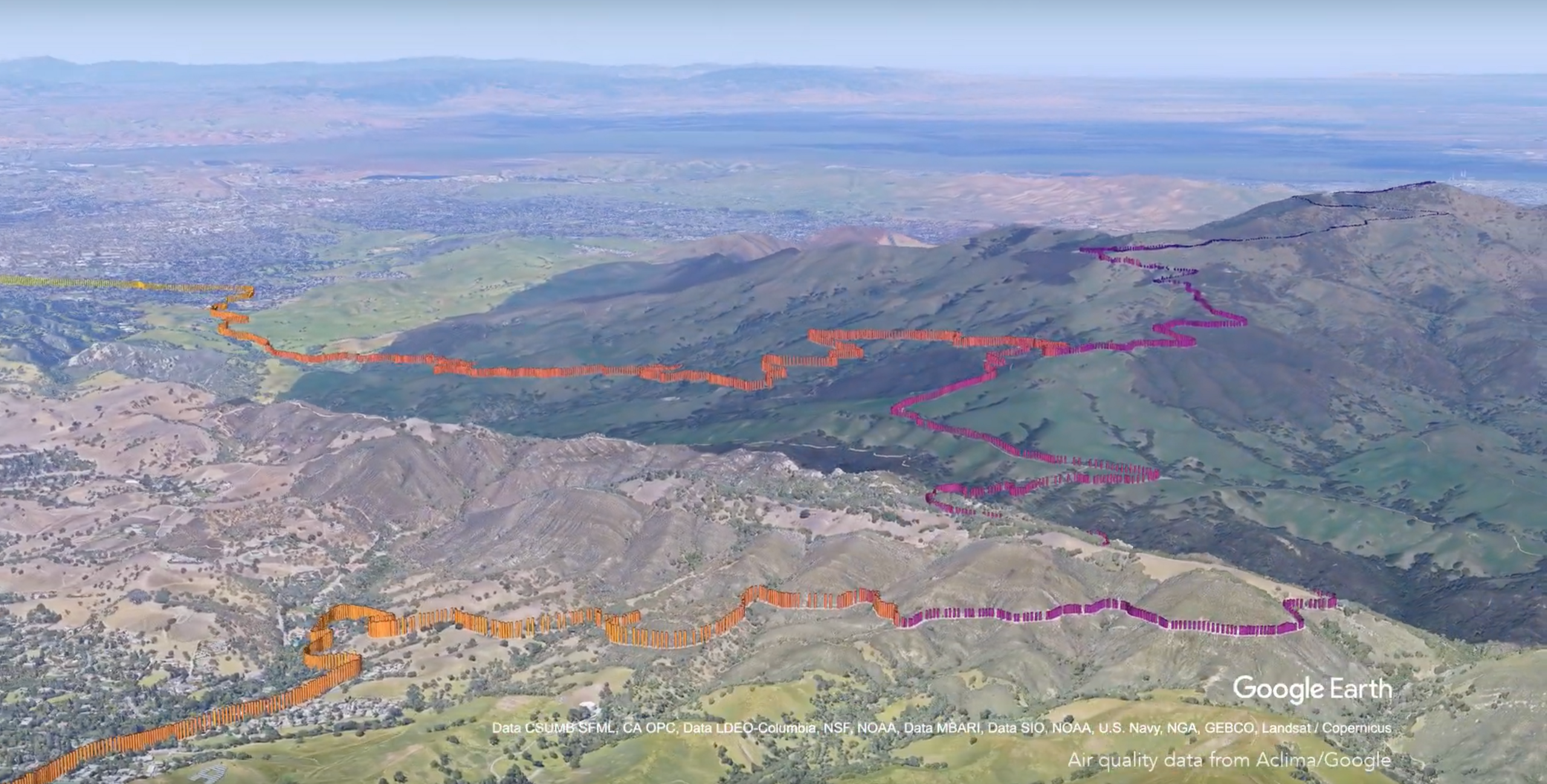
On Tuesday, October 10th, we drove one car in San Francisco and one car up Route 101 through Petaluma and up to Sebastopol, near Santa Rosa. At this time, fires were actively burning near Santa Rosa in addition to the Napa and Sonoma regions. The animation shows the path of the cars on that day. Time resolved pollution concentrations measured by the mobile platform are represented by colors that correspond to the EPA’s Air Quality Index (AQI). The circular markers show hourly AQI values as measured by the stations in the Bay Area Air Quality Management District’s air monitoring network.
The drive up to Sebastopol and back shows significant variability in the AQI. Focusing on the region from the Golden Gate Bridge to San Rafael, AQI values can range yellow to red in the morning over the space of a few miles. The drive back reflects the improving air quality in the afternoon. The AQI value reported by the car largely agrees with that from the monitoring station when it is nearby. The car which was mapping in San Francisco drove from the downtown area to the coast in the late morning. The data show a large gradient in AQI over the span of a few minutes and miles from unhealthy conditions downtown to moderate at the coast.
On Friday, October 13th, we directed one car to drive up to Napa Valley along Highway 29 to St. Helena as conditions allowed. The time resolved AQI measurements show severe pollution along San Pablo bay through Napa. At Yountville, the conditions quickly improved, indicating the boundary between an area with fresh smoke emissions to one whose air quality is primarily affected by regional mixing. These animations demonstrate that air pollution from dynamic events like wildfires can vary significantly over relatively short distances, and these patterns also shift rapidly in time.
How We Did It
We used two Aclima-equipped Google Street View cars from Tuesday, October 10th through Friday, October 13th, designing specific routes for each day depending on the predicted wind direction. The routes were designed to capture different aspects of the air quality impacts of the emissions from the fires. Some were designed to investigate plume behavior closer to the fires, while others took a look at the broader impacts in the San Francisco and East Bay regions. We measured the pollutants nitrogen dioxide, nitric oxide, ozone, black carbon, particulate matter, and methane.
AQ&U
Drought conditions coupled with climate change have made California more susceptible to fires. This year, the amount of land burned amounted to 853,457 acres, an area larger than the size of Rhode Island. Between 2014 and 2015, the state of California spent $209 million on emergency fund fire suppression expenditures.
In disasters, data can help protect public health and inform residents. These fires brought attention to air quality and the limits of current data to inform decision making during an emergency. Like hyperlocal air pollution we can see every day, wildfire-related pollution can also vary around a region. By sharing this hyperlocal data, we can help inform local residents and emergency responders as they fight the natural disaster. When situations are so dynamic, we need technology that responds to the need for real-time location-specific data to help inform mobilization efforts and response, while protecting public health.
Learn more
To request the data from this data snapshot, please apply here. Read our data snapshots of the Los Angeles and the Central Valley to learn about air pollution near LA schools, and what we found when we started mapping methane hot spots in the Valley.
Share this
PM 2.5 Surges As Wildfires Rage in California
Sensing Wildfire Smoke at the Street Level