Science

Delivering quality air data and insights rooted in science

Mapping pollution for action

Mobile monitoring is a powerful new approach to measuring and understanding air quality. Aclima's fleet collects air quality and climate pollution measurements within neighborhood blocks and across entire communities using rigorous quality assurance and control standards. We analyze and compile those data into interactive maps to help our customers enact equitable clean air action plans.

Our methods are driven by the best available science, much of which was developed by our team of air quality scientists, engineers, and technicians in partnership with leading experts in government and academia. Explore our publications ->

science page

What we measure

fine particulate matter (PM2.5)  •  ozone (O3)  •  nitrogen dioxide (NO2)  •   methane (CH4)  •  carbon monoxide (CO)
carbon dioxide (CO2)  •  black carbon (BC)  •  total volatile organic compounds (TVOCs)  • benzene, toluene, ethylbenzene, and xylenes (BTEX)

How we map air

Learn more ->

Block-by-block data collection
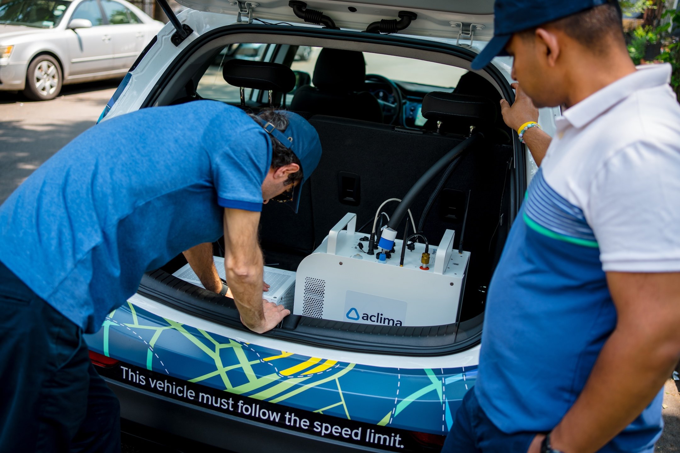
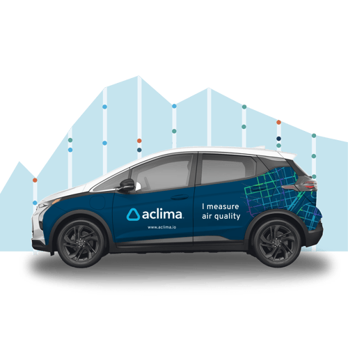
Step 1: Block-by-block data collection
With the Aclima Mobile Node on board, our cars drive every public street in the mapping area and collect data every second, uploading to the cloud as the car drives.
Multipass, intelligent driving
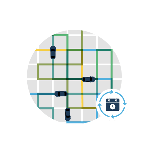
Step 2: Multipass, intelligent driving
The Aclima fleet drives every road multiple times to collect data at different times of the day, days of the week, and seasons of the year. Aclima’s intelligent algorithms plan the driving routes, track progress, and adjust to make sure the full area is covered evenly.
Pro 3
Step 3: Analysis & verification
The Aclima science team pays careful attention to data quality. The AMNs are regularly calibrated and the data checked to make sure the final, verified results are as reliable as possible.
Modeling & calculation
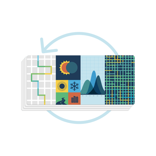
Step 4: Modeling & calculation
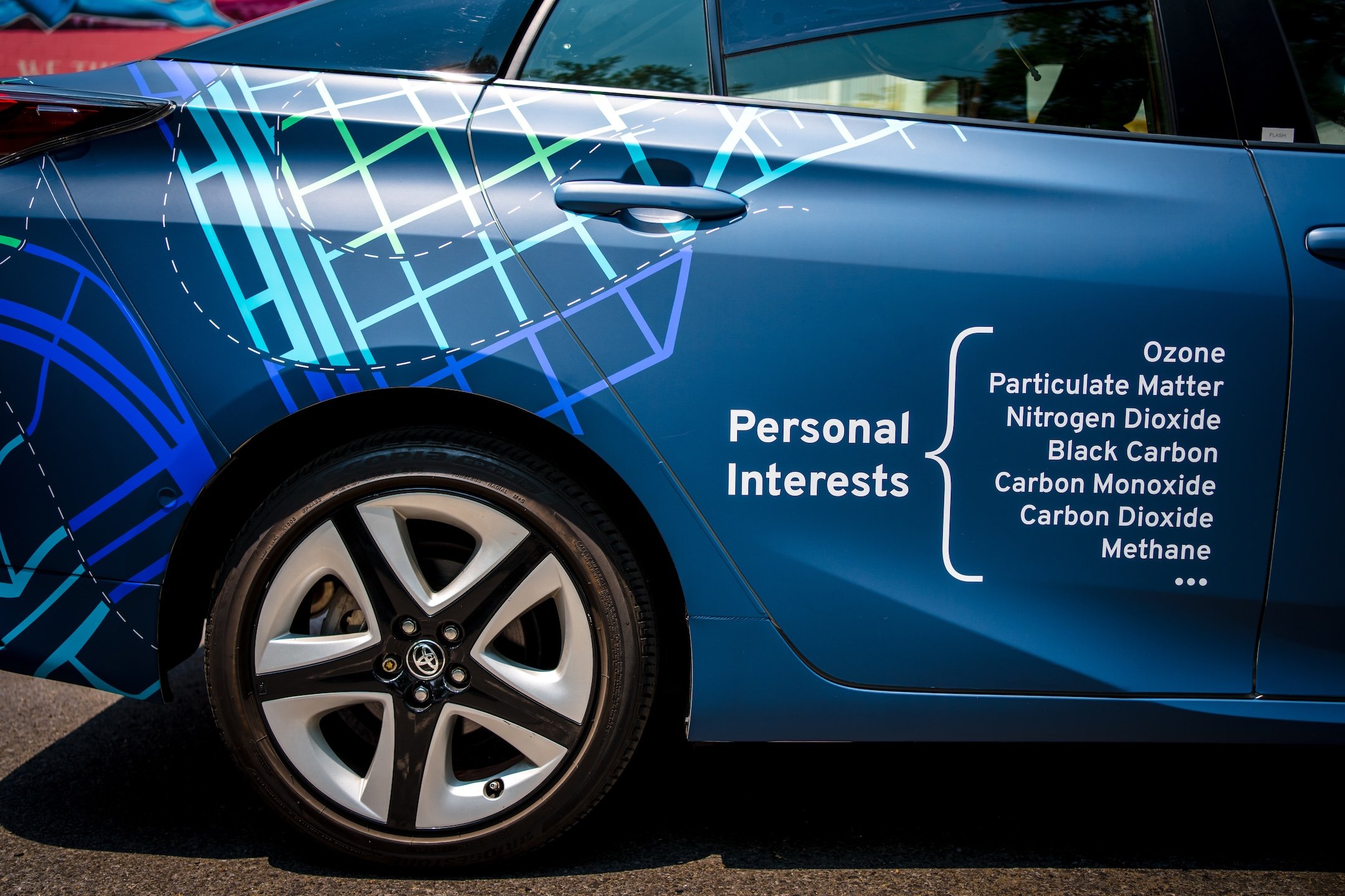
To calculate a single estimate of the annual (or “typical”) average for each pollutant at every location, Aclima feeds the verified data into a statistical model designed by our data science team. The result is a typical annual pollutant level for each location.
Visualization for action
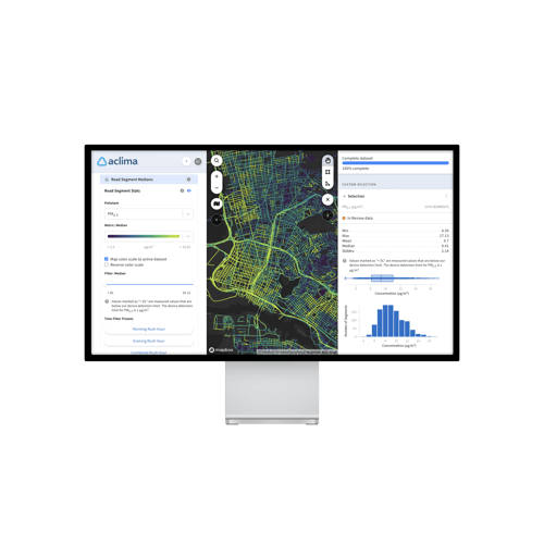
Step 5: Visualization for action
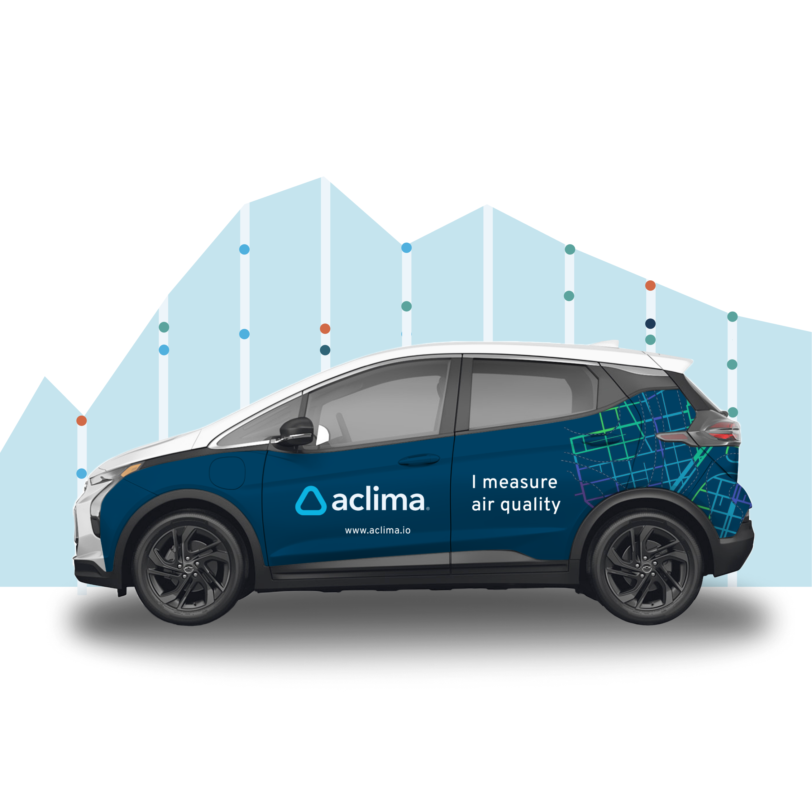
Aclima’s measurement method results in a lot of data points — about 30,000 for every mile we map. To help users explore and understand the information (and therefore take steps to improve air quality), Aclima creates interactive maps.

Air disparities in the Bay Area

Results from the first major application of Aclima's Community Impact and Investment Index across all 101 cities in the San Francisco Bay Area leveraging Aclima air pollution data from the largest region-wide mobile sensor network.

Grounded in science

Ensuring data quality

Data quality is a top priority for Aclima’s science team – we know that in order to use our data to inform action, decision makers need to be able to trust that they have gone through a rigorous series of scientific checks and balances. 

Aclima’s Quality Assurance system was developed to ensure all the processes that go into the creation of our hyperlocal maps support their use by communities and regulators for decision-making. 

A020-Aclima-DC-Launch-2023-Photography-by-Brittany-Diliberto_small

Aclima's Quality Assurance System

Our approach to designing a quality assurance system includes:

A015-Aclima-DC-Launch-2023-Photography-by-Brittany-Diliberto_small
Cooperative innovation

Science partnerships

Aclima partners with leading air quality scientists, researchers, and engineers to advance the development of cost-effective, scalable mobile monitoring solutions. 

Aclima has long-standing or past partnerships with academic institutions such as UC Berkeley, the University of Washington, and the University of Texas, as well as research collaborations with the United States Environmental Protection Agency (EPA). These partnerships have helped refine our methodologies and ensure scientific rigor in all our work. 

Our publications

Peer-reviewed papers